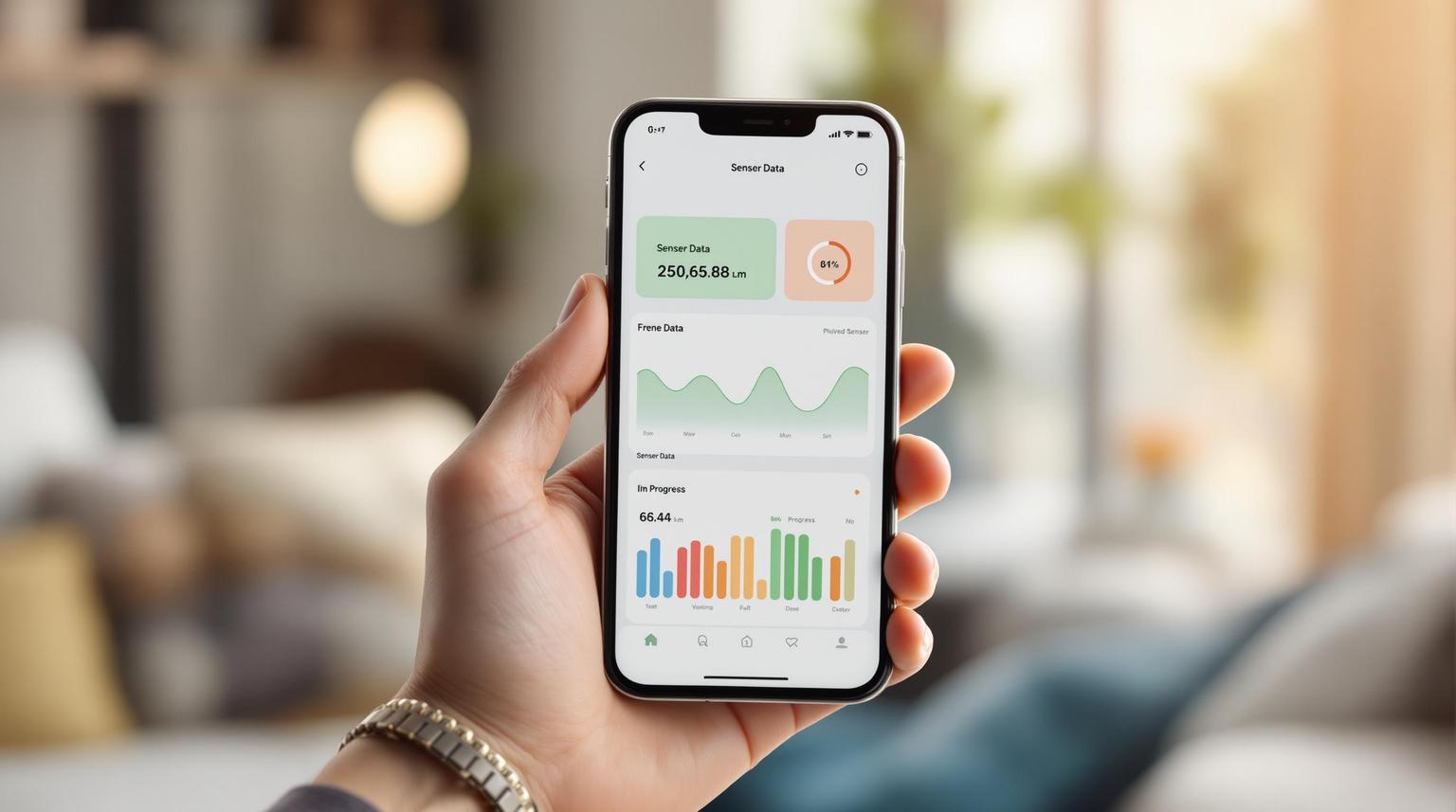
Mobile sensor data visualization doesn’t have to be overwhelming. With small screens and short attention spans, the key is to simplify and prioritize what matters most. Here’s how you can create clear, actionable displays for mobile users:
- Simplify the Design: Show only essential data upfront using techniques like progressive disclosure. Avoid clutter by removing unnecessary elements and using a limited color palette.
- Adapt to Mobile Constraints: Design for small screens and touch interactions. Use larger fonts, touch-friendly controls, and vertical layouts for easy navigation.
- Choose the Right Visuals: Use line graphs for trends, bar charts for comparisons, and gauges for status updates. Always include clear labels and units.
- Leverage Real-Time Features: Provide live updates and interactive tools like filters and drill-downs to keep users engaged and informed.
- Utilize Device Features: Integrate GPS, touch gestures, and sensors like accelerometers to enhance usability in real-world contexts.
IoT on Your Smartphone: Visualizing Mobile Sensor Data with Grafana | GrafanaCON 2024 | Grafana
Common Problems with Mobile Sensor Data Display
Visualizing mobile sensor data comes with its own set of challenges, quite different from those faced on desktop platforms. Tackling these issues is essential to create user-friendly mobile experiences that are intuitive and efficient.
Mental Overload and Too Much Information
One of the biggest hurdles is dealing with information overload. Mobile sensor apps often bombard users with a flood of metrics, alerts, and updates. When all this data is crammed onto a small screen, it can overwhelm users, making it harder for them to make decisions or complete tasks effectively. The constant stream of sensor-generated data can lead to frustration, app abandonment, and even negative perceptions of the brand.
To address this, designers need to simplify. Breaking down complex information into smaller, manageable pieces is key. Techniques like progressive disclosure – where only the most critical data is shown upfront, with additional details accessible as needed – help reduce cognitive load. By prioritizing essential metrics, mobile apps can guide users through data without overwhelming them. But that’s only part of the problem – mobile devices themselves introduce their own set of hurdles.
Mobile Device Limitations
Mobile devices bring unique hardware and interaction challenges that complicate sensor data visualization.
Limited screen space is a major issue. Data that fits comfortably on a 30-inch desktop monitor might require multiple screens on a 4-inch mobile device. As Raluca Budiu from the Nielsen Norman Group points out:
"Whenever you include a new design element or a new piece of content on the mobile screen, something else gets pushed out (or below the fold). Think hard of the opportunity cost of each new element: what does it mean for the users if you leave out element B in order to include element A? Is element A more important than element B?" – Raluca Budiu, NN/g
This trade-off forces designers to make tough decisions about what to prioritize.
Processing power is another limitation. Mobile devices lack the computing strength of desktops, which can slow down the loading of complex visualizations and drain battery life. Real-time updates from sensor feeds can push these devices to their limits. Additionally, the reliance on finger taps for navigation increases the risk of accidental clicks, further complicating interactions.
Fragmented attention spans also add to the challenge. Mobile users are often interrupted by their surroundings, leading to shorter session durations – averaging just 72 seconds compared to 150 seconds on desktops. Raluca Budiu explains:
"Mobile phones are portable: most fit easily in a pocket or purse and they tend to follow us everywhere. Because we use phones in a variety of contexts and situations, we are more likely to be interrupted when using such devices: an external event in the outside environment may demand our attention and require us to stop whatever we were doing on the small screen. As a result, attention on mobile is often fragmented and sessions on mobile devices are short." – Raluca Budiu, NN/g
On top of this, mobile connectivity issues can delay data loading, leaving users with outdated information when real-time accuracy is crucial. Studies show that accessing content on mobile is twice as challenging as on desktops. For sensor data apps, this means users may struggle to find the information they need quickly, especially in time-sensitive situations.
These limitations demand thoughtful design solutions that focus on simplicity, clarity, and ease of navigation – principles that will be explored further in the following sections.
How to Create Clear Data Displays
Designing sensor data visualizations for mobile devices is all about finding the right balance between presenting enough information and keeping it easy to use. These guidelines will help you create displays that are both functional and user-friendly.
Keep Visual Designs Simple and Focused
The golden rule of mobile data visualization? Simplicity above all. As Edward Tufte once said, "Clutter and confusion are not attributes of data – they are shortcomings of design". On compact mobile screens, every pixel matters.
Start by removing unnecessary elements like redundant titles, excessive grid lines, or decorative borders. This keeps the focus on the data that users need to make decisions. For instance, a temperature sensor display should highlight the current reading, while historical data can be tucked away for later reference.
Use a limited color palette – ideally just 3–4 colors – to emphasize trends without overwhelming the user. High-contrast combinations, such as dark text on a light background, ensure readability in all lighting conditions, whether users are outdoors in bright sunlight or indoors in dim environments. This approach helps users instantly spot critical data, like when a sensor reading crosses a threshold.
Typography and font size are equally important. Avoid using fonts that are too small, as they can strain the eyes, especially when users need to quickly glance at the data. Text should be legible on all device sizes without obscuring key information. Additionally, keep in mind that users might be wearing gloves or have varying finger sizes when interacting with the app.
Finally, design touch-friendly controls by ensuring buttons and interactive elements are large enough for users to tap accurately, even in challenging environments. This is particularly important for sensor apps where users may be multitasking or on the move.
Show Information Step by Step
Once you’ve simplified the design, focus on how to present the information in a way that prevents users from feeling overwhelmed.
Progressive disclosure is a powerful technique for breaking down complex sensor data into smaller, digestible pieces. By showing only the most important details upfront and allowing users to access more information as needed, you can make the data much easier to navigate.
Organize content vertically to match how users naturally scroll on mobile devices. For example, an air quality monitoring app might display the current air quality index and a color-coded status at the top. Users can then swipe or tap to reveal additional details, such as pollutant levels, historical trends, or location-specific data.
Enable user-driven exploration by adding intuitive ways to access more details. Tooltips that appear when users tap on data points can provide context without cluttering the main display. This approach caters to both users who want quick summaries and those who occasionally need in-depth diagnostics.
Understanding how users interact with your app is key. Study their behavior to ensure that frequently accessed details are easy to find, while advanced features remain available but unobtrusive.
Pick the Right Charts and Graphs
After simplifying the design and organizing the information flow, the next step is to choose the best visualization tools for your data.
The right chart type can make all the difference in how users interpret sensor data. Your choice should depend on the nature of the data, not on current design trends.
- Line graphs work well for time-series data, such as tracking temperature, humidity, or energy usage over time. They highlight trends and patterns, making it easy for users to see whether conditions are improving or worsening. Keep these graphs simple, with clear data points.
- Bar charts are ideal for comparing sensor readings across different locations or time periods. For example, they can show temperature variations between rooms, helping users quickly identify areas that need attention. Ensure the bars are spaced and sized for easy interaction.
- Gauge charts and progress indicators are perfect for showing current readings against predefined limits, such as battery levels or tank capacities. These visuals provide an at-a-glance understanding of status.
| Chart Type | Best For | Mobile Considerations |
|---|---|---|
| Line Graphs | Time-series data, trends | Use clear data points and keep timelines simple |
| Bar Charts | Comparing multiple sensors | Make bars touch-friendly and easy to read |
| Gauges | Status against limits | Highlight key readings for quick interpretation |
Context is everything when it comes to sensor data. Always include labels, titles, and legends to clarify what the numbers represent. Specify units of measurement (like °F, psi, or kWh) and time ranges to help users interpret the data quickly and accurately.
Tailor your visualizations to solve specific user problems rather than just displaying raw data. For instance, if maintenance is a priority, design charts that highlight predictive indicators instead of simply showing current readings. This approach ensures your visualizations provide actionable insights.
As Edward Tufte emphasized, "The essential test of design is how well it assists the understanding of the content, not how stylish it is". Focus on clarity and functionality so users can extract insights effortlessly.
sbb-itb-7af2948
Using Advanced Tech to Improve Data Display
Advanced technology empowers dynamic, real-time sensor data visualizations that take full advantage of smartphone capabilities. These methods build on earlier design principles, ensuring that clarity and interactivity remain at the core of every visualization.
Live Data Updates and User Interaction
Real-time updates turn static displays into dynamic tools, keeping users both engaged and informed. In fact, research indicates that 70% of users prefer interfaces with real-time updates compared to static ones. This makes real-time functionality a must-have for sensor data apps.
With real-time visualization, sensor data is displayed as it’s generated, allowing users to identify trends and anomalies instantly. To optimize your data pipeline, consider techniques like early filtering, indexing filter fields, applying TTL (Time-to-Live) settings, and using Materialized Views for pre-calculated data aggregates.
Interactivity takes things a step further. Features like tapping, swiping, and pinching transform passive viewing into active exploration. For instance, drill-downs can provide deeper insights, while dynamic filters let users customize their view by adjusting parameters like time ranges, sensor types, or locations. These tools don’t just make data accessible – they make it actionable. Businesses using interactive tools are 28% more likely to uncover timely insights, while platforms offering instant feedback see a 30% boost in user retention. By simplifying how users explore complex data, these features enhance usability without adding unnecessary layers of complexity.
Making the Most of Device Features
Modern smartphones come equipped with a variety of sensors that can elevate how users interact with data visualizations, creating experiences tailored specifically for mobile platforms.
- Accelerometers and Gyroscopes: These sensors detect movement, direction, and rotation, enabling features like automatic screen orientation or gesture-based navigation. This makes data exploration feel more immersive and intuitive.
- Touch Gestures: Pinch-to-zoom for detailed chart views, swipe gestures for navigating time-based data, and long-press actions for additional options all reflect how users naturally interact with their devices.
- GPS Integration: Adding location context to sensor data is invaluable for applications like environmental monitoring or fleet management. Mapping data to specific locations provides spatial insights that raw numbers simply can’t convey.
- Proximity and Brightness Sensors: These can adapt your app to different environments. For example, visual contrast can adjust for bright outdoor settings, while interaction sensitivity can change based on ambient light.
- Screen Orientation: Different orientations can highlight different aspects of data. Portrait mode might focus on current readings and alerts, while landscape mode could provide detailed charts and historical trends. This adaptive design ensures the best use of screen space.
The key to successful device integration is thoughtful implementation. Focus on features that genuinely enhance the user experience without overwhelming users with unnecessary complexity.
Case Study: Sidekick Interactive‘s Success in Sensor Data Visualization

Let’s take a closer look at how Sidekick Interactive tackled a real-world challenge in sensor data visualization and turned it into a success story.
A manufacturing firm approached Sidekick Interactive with a pressing issue: their factory floor sensors were producing massive amounts of data, but the existing mobile monitoring system was a mess. Operators were overwhelmed by cluttered dashboards and delayed alerts, making it nearly impossible to quickly identify equipment problems. The result? Costly downtime and missed maintenance opportunities.
The client needed a solution that made sense of the chaos – something that provided clarity without losing important details. Sidekick Interactive stepped in with a smart approach, using techniques like progressive disclosure and context-aware filtering. This allowed critical alerts to stand out while still giving operators the option to dive deeper into the data when needed.
The team also introduced real-time parameter adjustments, letting operators tweak alert thresholds to match their production needs. This adaptability was a game-changer, accommodating the wide range of operations within the factory.
To make the interface as user-friendly as possible, the design team focused on a strong visual hierarchy. Key alerts were displayed as bold notifications with clear action buttons, making them impossible to miss. Meanwhile, historical trends were tucked into subtle, non-intrusive charts. By incorporating plenty of white space and avoiding clutter, the interface remained easy to read – even in tough lighting conditions on the factory floor.
The results were immediate and impressive. Operators could identify issues faster, cutting downtime and improving maintenance workflows. Feedback from users highlighted reduced mental fatigue during long shifts, and the overall operational efficiency of the factory saw a noticeable boost.
This case study highlights how thoughtful mobile design can turn sensor data into a powerful tool. By prioritizing user-centered filtering, delivering context-specific information, and leveraging native device capabilities, Sidekick Interactive created a system that didn’t just solve a problem – it gave the client a competitive edge. It’s a clear example of how user-focused design can make all the difference when managing complex data on mobile platforms.
Conclusion: Main Points for Mobile Sensor Data Display
Displaying sensor data effectively on mobile devices comes down to one simple truth: most people can only handle about seven pieces of information at a time. This limitation highlights the importance of simplifying and organizing data to fit the way users naturally process information.
The foundation of good visualization lies in simplicity, relevance, and clarity. By presenting information step by step and keeping designs clean, you make it easier for users to understand what they’re looking at – without overwhelming them.
"Information overload occurs when the amount of input to a system exceeds its processing capacity. Decision makers have fairly limited cognitive processing capacity. Consequently, when information overload occurs, it is likely that a reduction in decision quality will occur." – Bertram Gross, Professor of Political Science at Hunter College
Real-time visualization is another game-changer, transforming raw data into insights that users can act on. Features like filtering and interactive tools allow users to focus on what matters most, giving them control over their experience and reducing unnecessary distractions.
A case study highlighted the power of user-centered design, showing how it speeds up decision-making and improves operational outcomes. Techniques like progressive disclosure, context-aware filtering, and a clear visual hierarchy played a direct role in boosting efficiency and delivering measurable results.
For industries dealing with sensitive or complex data, collaborating with experienced developers is crucial. Companies like Sidekick Interactive specialize in creating custom mobile apps tailored to IoT and data compliance needs, ensuring solutions that meet both technical and regulatory demands.
Whether you’re managing traffic systems, monitoring factory equipment, or tracking other sensor-based processes, the goal stays the same: focus on presenting the most critical information at the right time. By prioritizing clarity, reducing cognitive load, and aligning with user needs, sensor data becomes a powerful tool for decision-making rather than a source of confusion.
FAQs
How can I display sensor data on mobile devices without overwhelming users?
To make sensor data accessible on mobile devices without overwhelming users, aim for clarity and ease of use. Focus on presenting only the most important data points and keep the design clean and streamlined. Avoid unnecessary clutter by using simple layouts and prioritizing key information.
Use visual aids like charts, graphs, or interactive elements to break down complex data. These tools can help users grasp the essentials while offering the option to dive deeper if they choose. Incorporating real-time updates can ensure the data stays current and actionable, but make sure these updates don’t disrupt the overall user experience.
Interactive dashboards are another great way to let users explore data at their own pace. By designing with simplicity and functionality in mind, you can create an experience that feels both intuitive and engaging.
What are the best ways to create clear and user-friendly sensor data visualizations for mobile apps?
To create sensor data visualizations that are both clear and user-friendly for mobile apps, keep things simple and easy to navigate. Start with responsive design – this ensures that charts, graphs, and other visuals adjust smoothly to different screen sizes, making them easy to read no matter the device.
Focus on minimalism by cutting out unnecessary elements and emphasizing the most critical data points. This keeps the visuals clean and directs attention where it matters most. Adding interactive features like tooltips, zoom options, or filtering can give users the flexibility to explore data at their own pace without feeling overloaded.
Lastly, lean on intuitive visual cues such as color coding, clear labels, and straightforward layouts. These small but impactful details help simplify complex information, making it easier for users to grasp. Together, these strategies not only make the visuals more accessible but also create a smoother, more enjoyable experience.
How do real-time updates and interactive features improve the user experience in mobile apps for sensor data?
Mobile apps that incorporate real-time updates and interactive features are not only more engaging but also significantly improve user experience. By providing instant feedback, these apps ensure users always have access to the latest information. This is crucial for tools like health trackers or environmental monitors, where up-to-date data can directly influence decisions and prompt timely actions.
Interactive elements, such as customizable dashboards and live visualizations, allow users to personalize their experience and dig deeper into the data that matters most to them. By transforming complex information into easy-to-read graphs, charts, or interactive displays, these apps simplify decision-making and help users spot trends or patterns effortlessly. Together, these features make the app experience smoother, more intuitive, and ultimately more rewarding.